Intro
Branding is more than just a great logo; it’s how you make people feel when they come in to contact with your business, and how they respond to it. Branding speaks for you when you’re not in the room, whether that’s an email footer to a potential client or billboard ad to passersby. But it’s not enough to just look good. People are savvy and quickly see-through shallow brands with hollow promises: left unchecked reputations are quickly destroyed.
What did we want people to think, feel and do when interacting with HYELM?
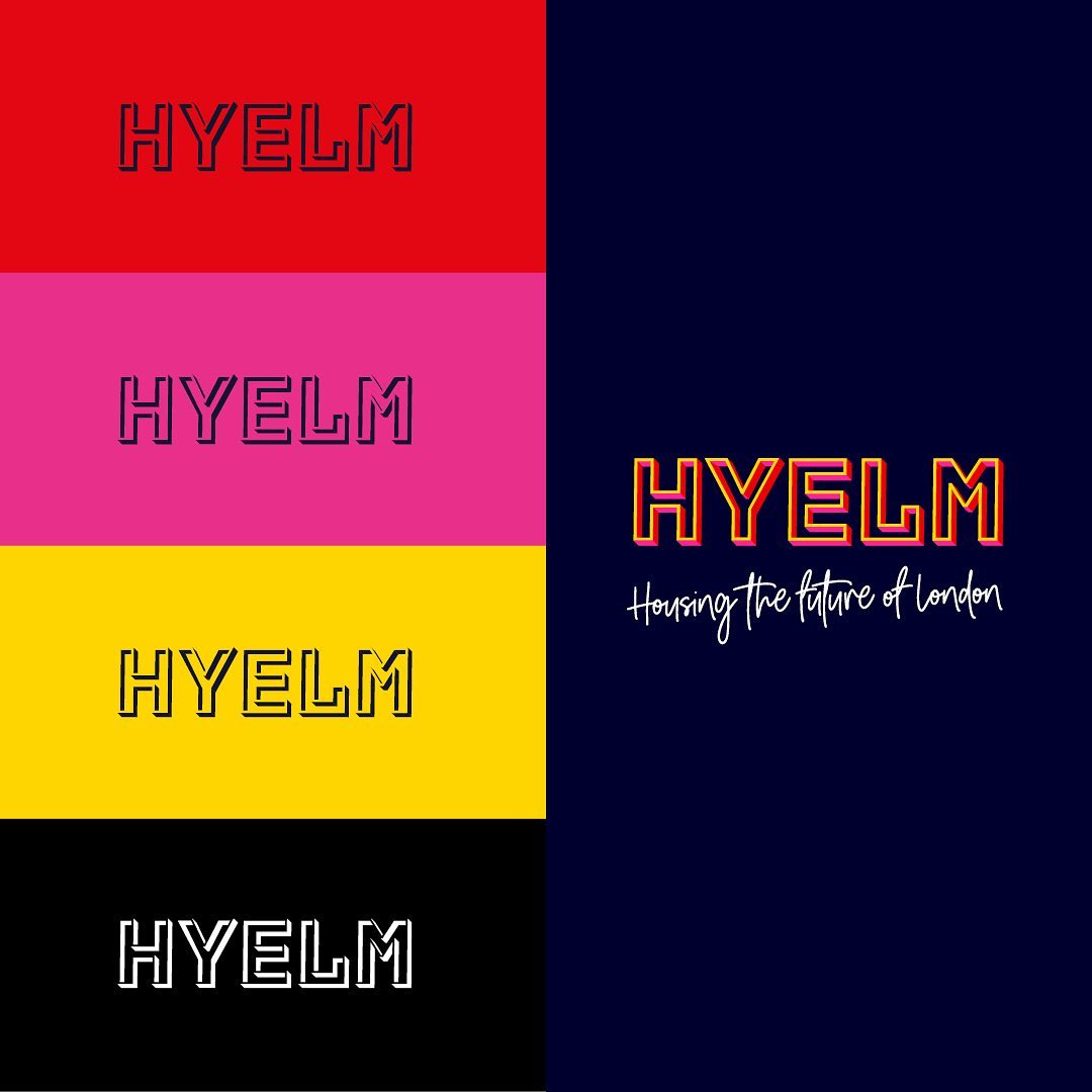
As an established provider of affordable, quality housing for young people in London for nearly 100 years, it was essential that the new identity was grounded in its heritage. In a city where rogue landlords are ten a penny, we also needed people to understand and believe that HYELM is on the side of its residents and making a positive difference to London’s housing crisis. Finally, we wanted people to feel inspired to become advocates of HYELM and spread the word. By putting residents front and centre we were able to design a bold and vibrant identity that not only stands out, but which young people relate to and want to engage with. The base colour blue instils confidence and inspires feelings of trust, loyalty and integrity. A contrasting colour pallet suggests youth and vibrancy, making people stop and take notice.